More About Me...

Lorem ipsum dolor sit amet, nisl elit viverra sollicitudin phasellus eros, vitae a mollis. Congue sociis amet, fermentum lacinia sed, orci auctor in vitae amet enim. Ridiculus nullam proin vehicula nulla euismod id. Ac est facilisis eget, ligula lacinia, vitae sed lorem nunc. Orci at nulla risus ullamcorper arcu. Nunc integer ornare massa diam sollicitudin.

Another Tit-Bit...

Lorem ipsum dolor sit amet, nisl elit viverra sollicitudin phasellus eros, vitae a mollis. Congue sociis amet, fermentum lacinia sed, orci auctor in vitae amet enim. Ridiculus nullam proin vehicula nulla euismod id. Ac est facilisis eget, ligula lacinia, vitae sed lorem nunc.

Harvey Nichols: Scared


Awesome ideas! It's out of the box for the sale's print ad. The mannequins are scared of sales promotion to put their clothes off to sale for discount. Though, it's simple but strong communication and the images tell the message. Advertising Agency: DDB London, UK, Executive Creative Director: Jeremy Craigen, Head of Art: Grant Parker, Photographer: Giles Revell, Art Director: Rob Messeter, Copywriter: Mike Cr

Softlan Ultra: Rugby


There must be a smile comes up from you seeing this print ad. The expression of a man which hug and adhere his head to the clothes of his player partner, look funny. He enjoy adhering his head with happiness expression. It's a very strong concept communicating the benefit of Softlan Ultra. By seeing the man's expression and the brand name you must know the product benefit. Advertising Agency: Y&R, Kuala Lumpur, Malaysia, Creative Directors: Rahul Mathew, Rowan Chanen, Art Directors: Richard Chong, Scott McClelland, Copywriter: Rahul Mathew, Retouching: Magic Cube

Volkswagen: Color


The teenagers and other young people must be familiar with this illustration. It's their characters, their life. Using this illustration is a good way to close the target market. They'll feel it's the part of their life. The copy: "Off course it's a VW Van, Ask your dad" It's a strong copy to involved their dad to decide buying. And by this copy means the product just for them... Advertising Agency: DDB, Paris, France, Creative Directors: Alexandre Hervé, Sylvain Thirache, Copywriter: Patrice Dumas, Art Director: Aurélie Scalabre

What the mother feels, the baby feels as well

St. Peters Hospital in Zagreb: Pregnance

"What the mother feels, the baby feels as well" Let's give effort to renovate the department for pregnancies at risk at the St. Peters Hospital in Zagreb. Donate by calling 0609004 or visit www.petrovatrudionica.com, Advertising Agency:........, Creative Director: Moe Minkara, Art Directors: Tonka Lujanac, Petar Popović, ana Belić, Gordana Golik, Copywriters: Tanja Škorić, Ivan Čepelak, Daniel Vuković, Ivan Čadež, Account manager: Ivanka Mabić, Published: January 2008

AOTW competition


This is a submission for the AotW-R competition. Wonderful illustration with strong concept. Let's say if there is no logo "AOTW" at the left below I think people will give the same perception: "Creative concept" As you know print ad is not only about art but also there are some other basic and important things inside, such as communication, creative strategy and Customer's response. Think, think and think which the right art and copy be executed. Art Director: Ola Olowu Copywriter: Babatunde Adebola Illustrators: JudeUzonwanne, John Nwabuwa

Audi Quattro: Hands


Nice art work! By hands grasping objects such as a slippery fish, a frog and a bowling ball to convey the road grip technology of Audi Quattro. With the strapline "independent grip, intelliently applied" draws parallels between the reactive Quattro technology and the way human hand adjust to grip different objects. If you'd like to see the tvc, you can click this audi quattro: hands "Quattro. Independent grip. Intelligently applied" Released: September 2008, Agency: BBH London, United Kingdom, Executive Creative Director: Nick Gill, Creative Directors: Kevin Stark, Nick Kidney, Art Director: Paul Yull, Copywriter: Ade Birkenshaw

Floralp Butter: Bread


Nice idea. Simple, clean but strong creative excecution. People will know the eating bread behavior when they eat. It's an outstanding ads near the street. People will remember the way they eat bread. " Eat up the bread with butter " Advertising Agency: Spillmann / Felser / Leo Burnett, Switzerland, Creative Director: Martin Spillmann, Copywriter: Maren Beck, Art Director: Karin Estermann, Photographer: David Willen, Agency Producer: Sebahat Derdiyok

McDonald's: Asian weeks

It's quite smart concept using media creative to convey the message of Asian weeks. It will be ordinary look if the head covering of woman by image or illustration. That's why I said it's smart approach of the promotional poster. What I still consider is why the clothes of color is white not red or another bright colors. White is sorrow for Asian (chinese) and white is not desired color for food. Is it? " Asian Weeks till 24th August " Advertising Agency: DDB Helsinki, Finland, Art Director: Jukka Mannio, Copywriter: Vesa Tujunen, Photographer: Mikko Harma / Kustom, Other additional credits: Mika Wist, Released: August 2008

Africa: Bullet


First impression seeing this print ad looks poor, sad and suffer. Empty dirty and broken plate with a bullet on the spoon. The colors of the wood table look dark. It seems there is no light and life in around the table. Simple and smart approach to convey the truth and actual life of Africans: the impact of War! Sadly! " Sadly, in parts of Africa, bullets still outnumber grains of rice " Advertising Agency: Draft FCB Ulka, New Delhi, India, Creative Director: Siddharth Prasad, Art Director / Illustrator: Shubhojit Sengupta, Copywriter: Vikram Sengupta, Other additional credits: Gettyimages, Published: August 2008

Now with Motorola GPS

There are some guys don't like this ad. They say it's ordinary and no reward. I think if we see from that angle it could be like that. But I see this ad is nice, simple, fun, and good communication for a brand behavior. It's very local and it works to increase the brand awareness and create new consumers. " Ming8. Now with GPS, thankfully! " Advertising Agency: O&M Beijing, China, Creative Director: Wilson Nils, Art director: Rain Yu, Copywriter: Chen Ning, Photographer: Zhou Yu Long, Published: November 2008

Abu Dhabi Airports Company: Salute

Abu Dhabi Airports Company, Nice art work. Clean, simple and strong to communicate a salute. Even so, it's a little bit funny to see the front plane. It's like a face with a spherical nose. But for the whole impression is great. "To be proud of service" "37th National Day of the UAE. We're proud to be of service" Released: December 2008, Advertising Agency: TBWA\RAAD\Abu Dhabi, UAE, Creative Director / Copywriter: Martin Lever, Art Director: Sherif Galal

Werner Hi-Fi store: Eye

" Close your eyes and feel the music" Is it the right statement for this print ad? I think yes it is. It's good idea the eye and notes places nearly to create the enjoyment and satisfaction of music. If we listen to the music sometimes we closed our eyes to get pleasant more deeply, right? Released: December 2008, Advertising Agency: Raimon Estrada, Barcelona, Spain, Copywriter / Photographer / Creative Director: Raimon Estrada

Intense Hair Fall Treatment by Dove

Dove: Fall treatment

By M. Ismail The first impression when you see this Dove print ads are the brush and comb which dominated the lay out. The brush and comb with the steel material make these things look hard for a woman hair. Its the interesting image and draw the attention to audience. But if you see more detail there is a small zoom in zoom out tool nearly the brush and comb. It's smart approach to show that there is no more hair falls after using the "Dove intense hair fall treatment". " Intense Hair Fall Treatment " Released: January 2009, Advertiser: Dove, Agency: OGILVY & MATHER ASIA PACIFIC, Country: HONG KONG, Category: Cosmetics & beauty products Advertising Agency (Name, City, Country): Ogilvy & Mather Asia Pacific, Executive Creative Director: Christen Monge, Creative Director: Troy Sullivan, Annie Wong, Regional Senior Art Director: Kenneth Kuan, Copywriter: Bradley Wilson Agency Producer: Brell Chen, Photographer: Eric Seow @ Beacon Pictures, Retoucher: Aries @ Yau Digital

Improve your brain by Brands Junior - Chicken Essence

I think it's a good idea to deliver the message "improving your brain". You see a robot step on the calculator means if your brain is improved you don't need calculator anymore (it's good) but the opposite just play around with robot you're getting smarter (no need tool like a calculator) is it? What about other optional ads? I think they are the same concept: The yellow pages ads means the memory is coming alive so you don't need to read much and the bear puppet the same concept with yellow pages. If I give wrong comments you can give yours... " Improve your brain " Advertising Agency: K I D, Bangkok, Thailand, Creative Director / Art Director: Puripong Limwanatipong, Copywriter: Vanboon Sankhavadhana, Photographer: 68 Studio co., Ltd., Designer/ Illustration: Chaiyaporn Benyakusol, Retouching: Somporn Inthong, Wanchai Suttikitiwong, Other additional credit: Wareemon Benjapong

McDonald's

McDonald's give something good to people in rainy season. Good idea but what is the relation to McDonald's food. Does McDonald's give nothing related to brand. How great McD. What about the size, can people will take shelter of rain. I'm not sure because the angle of back there can not see. It could be the same. So, how people stand there avoid he rain... But it's good idea for brand communication and brand social communication.... "Shelter served at McDonald's" Advertising Agency: DDB Denmark, Creative Director: Patrik Danielsson, Art Director / Copywriter: Mikkel Møller, Photographer: Thomas Juul, Published: March 2008

Drunken is Bed, so stop Drinking

There are many "stop alcoholic drinking" on print ads. The print ad below is very simple way to deliver the message that keep alcoholic drinking can cause a suffer one day. " Will one lead to another and another? You don't have to be an alcoholic to know that the first drink is the easiest to refuse. It's your choice to keep off the hook." " Stop drinking " Advertising Agency: Luvi Ogilvy, St Denis, Reunion Island, France Creative Director: Pedro de Oliveira Copywriter: Luis Vieira Photographer: Laurent Diat Retouch: beefactory Published: December 2008

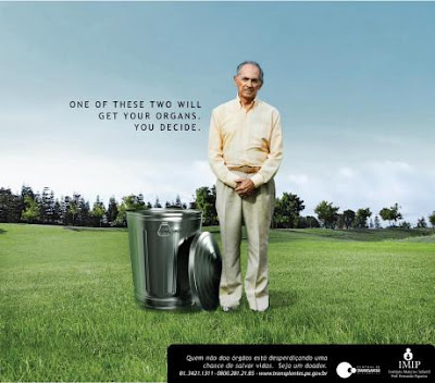
IMIP: Organ Donor


You decide. It's a good copy to let people think what the insight of the ad. Challenge the people to take decision. The image bring us to consider which the best choice. Useless organ someday or transplate to people who need, is it? But what I think is what kind of man want to transplate if he is in a good health. Or some people? Advertising Agency: Ampla, Recife, Brazil, Creative Director: Manuel Cavalcanti, Art Director: Humberto Montenegro, Copywriter: Juliana Lisboa, Illustrator: Queiroz, Photographer: Thomas Baccaro, Image: Erick Levay, Published: October 2008


different paths

college campus lawn

wires in front of sky

aerial perspective

clouds

clouds over the highway

The Poultney Inn

apartment for rent